

For my first production company logo I decided to keep it simple so it looked professional, my design was influenced by the twisted picture production company logo. This company does not have a specific genre it concentrates on. I wanted to use this production company to let my audience know this a quality first rated production company.
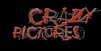
The Crazy picture logo on the other hand helps with the audience expectation. When they see this logo they will automatically know this based on a horror genre. I used red as it is a common colour convention in horror. The colour suggests fear, blood, etc.
No comments:
Post a Comment