Tuesday, 22 March 2011
Evaluation Question 4.


From the feedback I received I would say my trailer was successful in engaging the audience and wanting them to go to the cinema to watch it. Many praised the use of sound in creating suspense throughout the trailer. They also liked the choice of location. They praised the quality of the trailer saying it actually looked like it was a professional trailer this means that we successfully followed the convention of trailers. However, there are some points in the trailer which the audience gave us ideas to improve. For example they did say that the title was missing something and needed something to put more emphasis in it. They told us a voice over would be a good idea. The feedback I have received puts me in a good position to edit my trailer and make a very good final product.
From the feedback I received I would say my trailer was successful in engaging the audience and wanting them to go to the cinema to watch it. Many praised the use of sound in creating suspense throughout the trailer. They also liked the choice of location. They praised the quality of the trailer saying it actually looked like it was a professional trailer this means that we successfully followed the convention of trailers. However, there are some points in the trailer which the audience gave us ideas to improve. For example they did say that the title was missing something and needed something to put more emphasis in it. They told us a voice over would be a good idea. The feedback I have received puts me in a good
position to edit my trailer and make a very good final product.
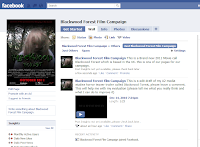
I also created a fan page on facebook for the campaign this would thus give me more feedback about what the audience thought about the trailer. They would be able to comment on status's and on the trailer it self.
Sunday, 6 March 2011
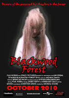
The Final poster
Voice over
Thursday, 3 March 2011
Uploading the first draft trailer for feedback
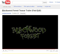

First edit of the trailer
Researching into sounds
Wednesday, 2 March 2011
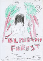
First draft of poster
Planing the poster
http://www.comingsoon.net/gallery/64282/The_Last_Exorcism_6.jpg
I decided to use this as a basis because this film was a successful horror film when released. I thought that if I followed a similar style to the poster we might have similar type of response as the 'The Last Exorcism" poster creates a sense of mystery. I placed the antagonist in the middle of the poster, the reason for this is because, it would draw people into wondering why a young girl is the main character or the main attraction, it will then gain interest and sense of enigma. People would want to come and see the film into because there is no way in which the poster gives out any information about what the film is about
Tuesday, 1 March 2011
Final Magazine Cover
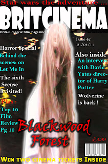
After evaluating the second draft of the magazine cover I felt that there was something missing from the cover. I realised that the magazine cover wasn't eye- catching enough and thus i thought I'd do another cover which i would then brighten the main image and darken the background so it looked like the main image was standing out from the magazine. Here is the final magazine cover
evaluation of second draft magazine cover
Second draft magazine cover
First draft Magazine cover
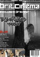
Planing the magazine cover
Thursday, 24 February 2011
Creating production details


Production detail research
Editing the footage
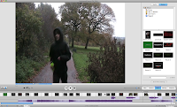
After we completed our shooting we uploaded all the footage on to a computer and we then started ordering them into chronological order using the software imoive. We then started cutting out any bits which was not needed in the trailer and removing unwanted footage. Our target was to make a trailer for about 90 seconds long and so we had to remove some scenes which we felt was no needed. We started adding effects to some scenes, for example, we had to make part of the trailer representing the past so we added a black and white effect on it etc. Some scenes were very slow and we wanted to create a sense of pace in the trailer, we did this by cutting shots and showing the action from different positions.
Shooting day.
reschudule/ change of location
Final design title
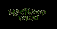 we decided as a group that we would change the colour of the title from grey to green the reason for this is because all though the grey did represent to us the genre of the film, however, we thought that it would catch people attention because it was bit dull on the eye and so we added the green and also it goes with the film forest.
considering titles

producing the title



Organising props and costumes
Deciding the title
Completed script
Shot list
StoryBoard
Looking into other genres
Example of musical genre:
- High School Musical
- Oliver Twist
- Grease
- Battlestar Gilactica
- Star Trek
- Mean girls
- bring it on
- Wild Wild west
- the good the bad the ugly
- indiana jones
Monday, 21 February 2011
Our synopsis
Year’s later locals began to hear child-like laughter coming from the forest. People where being drawn in to the forest by the sweet childish laughter thinking a child is lost and needs help. Little did they know that the spirit of Lucy dwelt in Blackwood and swore revenge on anyone who entered Blackwood Forest where she lays? Resident’s notices that many people from the community have gone missing, locals state they last saw them last entering Blackwood Forest. Search parties where sent out to find them.
Tally marks made out from blood marks where the only thing that’s left on the tree to give the people any clues to what is happening. Blackwood Forest was abandoned by the local government and no one entered it again.
This is a story of how a little girl gets her revenge and takes out her anger on her community. You might have thought Lucy Bower was a goner, well you better think again.
Research into synopsis
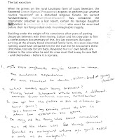
A synopsis is basically a summary of what happens in the film. In today’s lesson I researched into variety of synopsis from different horror film. During this research I looked closely in what was required in a synopsis. This would then help me when creating my own synopsis for my film. Looking into all these synopsis I started to realise a similarity in all of them. All followed a similar convention of having a protagonist and an antagonist and playing with the audience expectations. Its as if the synopsis gives a glimpse of what will happen in the film without revealing too much a ruining the film for the audience. I also reliased that all the horror genre have sub genres attached to them such as supernatural, thriller etc. this task helped a lot into understand what a synopsis is designed for. It has made it easier for me to create a synopsis when its time to make one for my film. Furthermore, I realised that synopsis all contain the protagonist, antagonist stock characters and i have highlighted them in one of the synopsis I analysed.
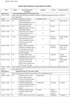
Shooting schedule
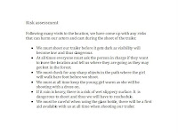
Risk assesment
Here is a summary of the risk assessment:
Questionnaires results
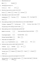
Most of the people who answered these questionnaires where our target audience. This gave us boost in what was required in are horror trailer to make it successful. We took into consideration, the likes and the dislikes were in current horror films from our target audience and we will try to implement them in our trailer.
In considering the location of the film we asked what our target audience what location appealed to them when watching a horror film. We considered five location haunted house, mansion, school, forest, a house. From our results the most popular location was the forest, and when asking the audience what appealed the most in the horror film they said the location. So we took this very seriously in planning our trailer. We decided that one of the locations must be the forest. Also, many complained that horror films are just not real enough these days and so we have tried to keep the trailer as real as possible by using minimum effects. In addition, we decided to use a mixture of fast and slow pace shots in the trailer as this was what our audience suggested makes trailers more effective than others. Reflecting on the results from the questionnaires we will closely follow what the opinions of our target audience is because they have said that what attracts them to go and watch a film is mainly the trailer and so we must make them trailer as effective as possible in attracting out audience.
Target audience
- · 15+
- · Male and female
- · Interested in horror genre
- · Interested in technology , social networks
- · Allowance of more than £10 + a week
- · May have a part – time job or volunteer
Charlie is 16; he lives in the city with his mum and dad in a two bedroom house. His mum doesn’t work, while his dad is a cab driver. In his free time, Charlie likes going out with his friends to the cinema on a weekly basis and spends around £5.60. He has his own laptop at home which he uses to keep up to date with his social life and what’s happening around him.
Saturday, 19 February 2011
Element of horror genre
Wednesday, 16 February 2011
Questionnaires
Here is the copy of the question my group came up with. we will be giving the to our target audence to fill in :
Tuesday, 15 February 2011
Research into certification

As my film is going to be certified as a 15 + I have to do some research into what isn’t allowed to be shown in the trailer. To do this I visited the website www.bbfc.co.uk and gain my information from here.
In my trailer I’m allowed:
“Strong threat and menace are permitted unless sadistic or sexualised.”
“Nudity may be allowed in a sexual context but without strong detail. There are no constraints on nudity in a non-sexual or educational context.”
“Violence may be strong but should not dwell on the infliction of pain or injury.”
“Drug taking may be shown but the film as a whole must not promote or encourage drug misuse.”
These are some example which is permitted for a 15+ trailer which I will have to follow when creating storyboard.
Music / sound
Without music and sound effect horror films would lose its power to create any suspense or tension. The most effective tool used to frighten the audience is the use of music. Just imagine any horror film, where this a dramatic part if you mute the sound you would realize that the scene isn’t scary at all. Music plays a very important role in creating a successful horror film.
The most common type of music used in horror is orchestral music. This type of music has been used since the genre was made. The reason for the use of orchestral music is that it allows us to or send out emotions in a better or effective way. You are able to use variety type of instruments to create your very own mood which is suited to the film. However, the use of an orchestral has fell due to new technologies. For example people are able to create music on a pc with software such as fruity loops etc. due to technology people are able to use virtual instruments to create their very own music.
We have decided to use a child as our antagonist and thus I will go through horror trailer which also use little children and see what the similarities are and the difference which will then help me when making my horror trailer.
Characters
In our concept we have decided to go for a girl to be the antagonist. This is because we want to go against tradition convention of having a big bulk scary man as a killer going around killing/scaring people.
Here is the antagonist from the film ‘The Ring’. The use of a child here creates confusion because a little child is deemed to be innocent and peaceful however in this film we see the complete opposite. She is a ruthless and a very dangerous girl. Furthermore, her face is always hidden which makes the a
udience feel cautious about her, it’s as if she uses her hair is there to cover her face like a mask would.
In this film ‘Orphan’ they have also decided to go with the main antagonist as a little child. The reason why children are used is because a stereotypical view of a little girl is harmless. However, they like to play with audience expectations. They want to believe you to believe she is innocent but we find out that she also a very dangerous girl. The difference between this film and The Ring is that throughout the film she is conveyed as an innocent individual but she is not. Audience find it hard to know what’s happening and thus makes them more interested into the film. There is a sense of mystery throughout the film about the girl.
Using a young female child has become common recently in horror films, this is because they are mysterious. the audience don't know what to expect from a little child. they believe she is innocent and when the audience finds out she is evil they become more interested as to why she has become like that.
we have chosen to use a young female child similar to the films above because we think it will create the most interest from the audience. This research has made me realise that using a child has more greater effect than using a traditional big bulky man.


