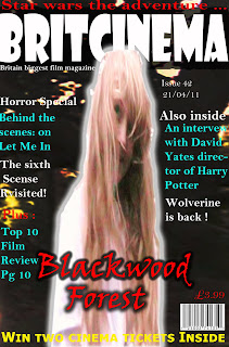
After evaluating the second draft of the magazine cover I felt that there was something missing from the cover. I realised that the magazine cover wasn't eye- catching enough and thus i thought I'd do another cover which i would then brighten the main image and darken the background so it looked like the main image was standing out from the magazine. Here is the final magazine cover
No comments:
Post a Comment