Tuesday, 22 March 2011

The Official trailer : BlackWood Forest

Evaluation Question 4.

What have you learned from your audience feedback?

To review the effectiveness of the teaser trailer and to evaluate my trailer I went out to gather audiences feed back of the trailer. I started off by uploading the trailer to YouTube and then I posted the link up on Facebook for initial feedback. The reason I did this is because majority of our target audience have a Facebook account.


This was a very effective way in which I received very good comments about the trailer. there were many aspects of the trailer the audience liked and disliked which we can change when finalising the trailer. One common aspect that came up was that the quality of the camera was very low. This may have of been because the quality reduced when converting into YouTube so it will not be a problem when finally released.


There was very positive feedback from the audience about the trailer although there is a lot that can be improved in this trailer. People praised the use of music to create a sense of suspense and worked effectively with trailer.


Many did give us feedback on how we could improve the trailer which we will take on. This person here gives are very good feedback about the trailer, and how we cold improve the titles and so when finalising the trailer we added a voice over to create more impact.


Although this was very effective for audience feedback I wanted to gain a more knowledge and understanding what the general public thought of the trailer and thus interviewed our target audience. This would thus put me in a better position to when finalising the trailer.

From the feedback I received I would say my trailer was successful in engaging the audience and wanting them to go to the cinema to watch it. Many praised the use of sound in creating suspense throughout the trailer. They also liked the choice of location. They praised the quality of the trailer saying it actually looked like it was a professional trailer this means that we successfully followed the convention of trailers. However, there are some points in the trailer which the audience gave us ideas to improve. For example they did say that the title was missing something and needed something to put more emphasis in it. They told us a voice over would be a good idea. The feedback I have received puts me in a good position to edit my trailer and make a very good final product.


From the feedback I received I would say my trailer was successful in engaging the audience and wanting them to go to the cinema to watch it. Many praised the use of sound in creating suspense throughout the trailer. They also liked the choice of location. They praised the quality of the trailer saying it actually looked like it was a professional trailer this means that we successfully followed the convention of trailers. However, there are some points in the trailer which the audience gave us ideas to improve. For example they did say that the title was missing something and needed something to put more emphasis in it. They told us a voice over would be a good idea. The feedback I have received puts me in a good

position to edit my trailer and make a very good final product.

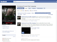
I also created a fan page on facebook for the campaign this would thus give me more feedback about what the audience thought about the trailer. They would be able to comment on status's and on the trailer it self.
Evaluation question 3


Evaluation question 2

Evaluation Question 1.

Sunday, 6 March 2011

The Final poster
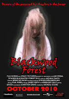

This is the final changes of the poster, I decided to change the design as I thought the initial poster was missing something. it looked a bit dull and not eye catching enough. when I looked closely into other film poster I realised they all looked scary and eye catching. The main character was at the centre of the poster and so I followed the design.


Voice over


After some feedback from the audience we have decided to add effects on the credits as our audience was saying something was missing from it. we decided to use non-diegetic sound of someone voice to repeat the credit we also then edit the voice by digitally manipulating the voice. we edited the pitch and made the voice sound deeper this creates anticipation to the audience as the voice sounds scary and menacing. Here is where we used the voice overs:


Thursday, 3 March 2011

Uploading the first draft trailer for feedback


After I completed the first draft I converted the trailer and uploaded it on to two key website such as Youtube and Facbook. These networking sites will allow me to gain feedback on to how to improve my first draft trailer.

Youtube:


Facebook:


First edit of the trailer


This is the first edit of the trailer Blackwood forest. i will upload this trailer to sites such as Facebook and Youtube so I can gain some feedback from my audience on how to improve this trailer.

Researching into sounds

http://www.partnersinrhyme.com/soundfx/scary_halloween_sounds.shtml

After we organised all the scenes in chronological order we started to add effects and sound into the clips. We had to look into sounds which would be best suitable for the trailer. i started of browsing for sounds on the internet, I had to always check if any of the sounds were copyrighted, if so then we could not use them in our trailer. After browsing many sites I eventually found a a website where they had all the effects that we needed and had no copyright. We then started taking effects from this site and adding it to the trailer.

I also browsed on the internet for a soundtrack to the trailer. I looked for a soundtrack that would create some kind of suspense in the beginning of the trailer, so this would draw our audience into getting them ready for something but not giving anything away. After looking at various websites, I found a soundtrack from this website:

Wednesday, 2 March 2011

First draft of poster


I showed some pf my target audience this poster and they gave some tips on how to improve it. they told me that the poster was eye catching like very dark and needed something to stand out more and thus i have decided to create a final poster for my campaign.

Planing the poster


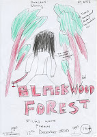
I was in charge of planning and creating the poster. In my initial research into poster, I adopted a similar style poster to the poster of The Last Exorcism.
http://www.comingsoon.net/gallery/64282/The_Last_Exorcism_6.jpg

I decided to use this as a basis because this film was a successful horror film when released. I thought that if I followed a similar style to the poster we might have similar type of response as the 'The Last Exorcism" poster creates a sense of mystery. I placed the antagonist in the middle of the poster, the reason for this is because, it would draw people into wondering why a young girl is the main character or the main attraction, it will then gain interest and sense of enigma. People would want to come and see the film into because there is no way in which the poster gives out any information about what the film is about

Tuesday, 1 March 2011

Analysing front cover magazine

Final Magazine Cover


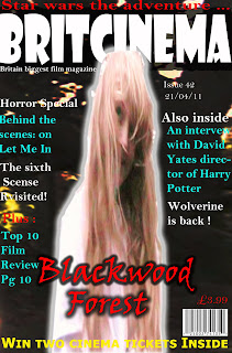
After evaluating the second draft of the magazine cover I felt that there was something missing from the cover. I realised that the magazine cover wasn't eye- catching enough and thus i thought I'd do another cover which i would then brighten the main image and darken the background so it looked like the main image was standing out from the magazine. Here is the final magazine cover

evaluation of second draft magazine cover

The magazine followed many of the key convention, such as putting the main character in the middle of the magazine cover. The purpose of this is to grab the reader attention and get the reader interested in the film and thus the primary reason to buy the magazine. Other key conventions have been followed, for example the character covers the title of the magazine which shows significance and the importance. Also the writing on the sides is there to persuade the reader to buy the magazine and to tell them other stories which are featured in the magazine.Furthermore, there is a website on the magazine, which interested reader can browse if they are interested in the film and want to go watch it. the common convention such as date, price and bar code are placed very clearly as this is what consumer look for when buying a magazine.

Analysing second draft magazine cover

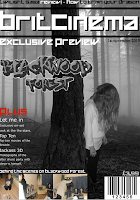
Second draft magazine cover

I then looked at the first draft of the magazine, there was many faults which needed to be addressed due to my peer not following the actual plan of the magazine cover and thus I chose the decision to create the final draft of the magazine cover. I used the software Adobe Photoshop to create this:


First draft Magazine cover


This is the first draft of the magazine cover. This was designed by my fellow team member Alex. First impression of this magazine cover is that, it seems that the magazine looks plain the black and white is effective in emphaising the genre, however, this in then takes any impact of colours to attract the consumer to buy the magazine. the magazine does follow common convention such as having the barcode, price. this is what the consumer looks at when buying magazine. Overall i would say this is not a very effective magazine cover to attract the audience and the reason for this is because he did not follow the plan.

Planing the magazine cover

Here is a plan of the film magazine cover. At the stage I had plan out the magazine cover. This stage wasn't as much difficult due to the research I did on existing film magazine covers. I tried to use all the convention of magazine cover to make my magazine look realist as possible.