Thursday, 24 February 2011

Creating production details


For my first production company logo I decided to keep it simple so it looked professional, my design was influenced by the twisted picture production company logo. This company does not have a specific genre it concentrates on. I wanted to use this production company to let my audience know this a quality first rated production company.

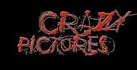
The Crazy picture logo on the other hand helps with the audience expectation. When they see this logo they will automatically know this based on a horror genre. I used red as it is a common colour convention in horror. The colour suggests fear, blood, etc.

Production detail research

One of the recognisable convention of a trailer is the production details. the production details appear at the beginning of the trailer, they are the most important feature of the trailer as they tell the audience what type of genre the trailer will be. Here are some production details which will influence my ideas and I will be using Photoshop to create the production details.

Editing the footage


After we completed our shooting we uploaded all the footage on to a computer and we then started ordering them into chronological order using the software imoive. We then started cutting out any bits which was not needed in the trailer and removing unwanted footage. Our target was to make a trailer for about 90 seconds long and so we had to remove some scenes which we felt was no needed. We started adding effects to some scenes, for example, we had to make part of the trailer representing the past so we added a black and white effect on it etc. Some scenes were very slow and we wanted to create a sense of pace in the trailer, we did this by cutting shots and showing the action from different positions.

Shooting day.


We started filming on the 10th of November at the first location which was the house. We waited till the day got dark so when recording it would create a atmosphere. For example because it is dark it will put a mood of evilness in the audience and a sense of mystery. For the house location we used one of our team member house (Micheal). This was a perfect location as it matched with our synopsis, and the mise en scene went with our trailer. We also had to make sure the recording was not delayed due to the cold weather. On the 12th November we filmed are second section of the trailer, this was at the second location in the forest. All our actor met up at a time we set and made our way to the location. We had some problems in getting our props and thus tried to adjust to the props we had.

reschudule/ change of location

We had decided a day and time for shooting our trailer but we came across a big problem. The location we initially wanted to shoot was occupied and we weren’t granted access to us. We had to be calm and organized, after lengthy discussion with each other; we tried to find a location which was the most similar to the initial location. After visiting the forest in Woodford we decided that our new location to shoot will be Woodford. The reason for this is it met the same requirement to our first location. We have now created a new shooting schedule for this day.

Final design title

we decided as a group that we would change the colour of the title from grey to green the reason for this is because all though the grey did represent to us the genre of the film, however, we thought that it would catch people attention because it was bit dull on the eye and so we added the green and also it goes with the film forest.

considering titles


we went for a design that we felt would generate a sense of mystery when the audience looked at it. we chose a dark grey colour as the title with black drop adds, this would thus create a sense enigma. the grey colour could represent dullness, plain etc. we wanted to challenge the convention and not just put red to highlight it is a horror genre. I think we have successfully created a title which by looking at it can give u a sense of what type of genre the film will be.